Our challenge this month was to select one of these beautiful chairs from Horchow to inspire our virtual room. Our client could be imaginary and if chosen, the budget unlimited.
I chose this beauty.

Where I started:
1. The Horchow chair's color automatically led me to my wall color:
2. Martha Stewart, Azurite. I love green and blue together, and although it's dark, I kind of like the idea of a moody bedroom.
3. Erin from Skoots and Cuddles used this gorgeous image from Lonny Magazine as inspiration for her dining room. I immediately fell in love with the navy walls, crisp white accents and wood tones. I knew I wanted to incorporate this look into my master bedroom.
4. Right after Sarah posted the challenge, I came across this bedding from Land's End and knew it would be perfect in my virtual space,
5. and would work with my existing Captain's bed which is similar to this one from Pottery Barn, minus the headboard.
Here's how the room evolved:
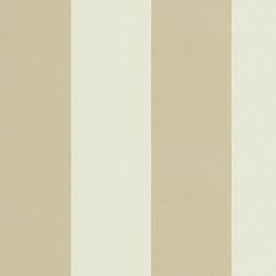
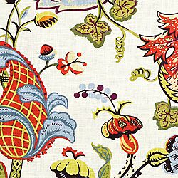
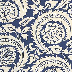
1. Fabrics for the space top to bottom, Cotillion Stripe Khaki (for a DIY upholstered headboard), Wilmington, Multi by Covington (for 3 Euro pillows), Tala Bluemarine (a long bolster for bed), Lisbon Linen in Indigo (a throw pillow for chair or to trim the edges of the curtains), all from Calico Corners.
2.Accessories: a ) gorgeous red mirror for a pop of color and a little Americana, b) framed personal letters as seen on Emily A. Clark's blog highlighting Cote de Texas for personal, inexpensive artwork, c) and brass sconces on either side of headboard since we have little room for bedside lamps.
3.Windows: we already have these room-darkening drapes over bamboo roman shades. I would trim them with similar grosgrain ribbon or the Lisbon fabric from above, for some added interest.
4. We have nightstands similar to this one I found on Pinterest from Centsational Girl, which I would add these Anthropologie knobs to for another touch of green.
5. I fell in love with this rug from Shades of Light for its sort of modern, nautical note and the way it connects to the headboard fabric. I think the wide stripes in both help to balance some of the more feminine aspects of the room and add some contrast.
6. The Land's End bedding
7. The inspiration chair from Horchow
8. I fell in love with this dresser from West Elm. I love the tones of the wood and its simple, slightly rustic, yet clean-lined form.
Fabrics up close:


Looking at the "space" as a whole, I see a hint of a modern-nautical look which I think fits my husband and me pretty well. I'm not sure if I'm brave enough to go so dark in my real space, but the mood board definitely helps me to visualize the potential for this look in our room.
Thank you Sarah, for hosting this fun challenge once again! Please visit Sarah's blog Pewter + Sage to check out all the talented bloggers who are participating in today's party.
Have a great day. I'll be back in Blogland, catching up on my favorite reads and sharing my bathroom facelift later this week.
Erin


Beautiful room! I love that rich peacock blue on the walls!
ReplyDeleteAnnie
House on Rene
What an amazing board you put together! I wasn't crazy about the chair until you paired it with all the other colors and textures. Love your fabric choices too!
ReplyDeleteWhat a dynamite look you have pulled together with this chair. Love your fabrics and all of the details including the blue walls and the dose of stripes. Nicely done!
ReplyDeleteLovely space Erin! That floral fabric is so perfect to pull those gorgeous colours together! All the natural textures work perfectly with the distressed chair as well xx
ReplyDeleteAnna (My Design Ethos)
Great space! The combination of all the fabrics is so fun and I absolutely love that dresser!
ReplyDeleteI really think that you're on to something here Erin, and the fact that you related it to your own bedroom makeover is a great idea too. I think you will certainly be pleased with the Lands End bedding if you decide to go that route - I've been really happy w/ my shams so far and you can't beat the price. I think you've mixed in your accessories, fabrics, and furnishings really well. MBM is a great post/activity to get back in the saddle! ;)
ReplyDeleteWelcome back, Erin!!! Sorry you had such a rough month, but I hope you are feeling better now:)
ReplyDeleteThis room is dynamite!! Too funny that we both put our green chairs in bedrooms (a couple of other people did too) and yet our rooms are worlds apart! I think it is so cool, that's what I love about this challenge. I never would have thought this curvy, feminine, kinda French chair could ever be in the same sentence as "nautical"...and yet you pulled it off perfectly!! I love how you considered the masculine in here... I got lazy, realized my room was pretty girly and just decided on the spot that it was for a "female only" client...oops!! I really love the fabrics you chose, especially the floral, that was a great find for pulling everything together. And that rug is so cool! I'm so glad you included that numbered graphic that showed your process, so interesting!!! I feel like we are all kinda working the same way, yet, the second and third choices we make after the inspiration piece take us in so many different directions, its awesome!! I'm so happy you came back to blogland to play with us:)
What a fun project, Erin! Great job! It just goes to show you beat that ole virus and came back strong!!! :)
ReplyDeleteAmazing board, Erin! I love that you went deeper with the wall color - It is stunning yet relaxing. The floral fabric ties in beautifully with the chair. Altogether a stunning yet relaxing space and I love that you included woven, natural elements. These, the linen and the chair will lighten and brighten up the space with the blue walls.
ReplyDelete